Charts
Learn how to visualize data, goals, and progress using Pivot’s charting capabilities for insightful and informed project management.
Charts offer a powerful way to visualize data, goals, and progress within your projects. Whether you’re tracking team performance, visualizing goal completion, or analyzing key metrics, charts provide clear insights to keep everyone aligned and informed.
Chart Settings
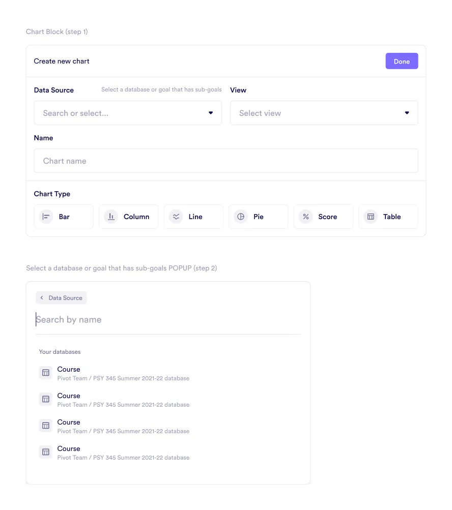
Creating a chart in Pivot is straightforward, thanks to its intuitive interface. Members can configure data sources, customize views, and select the most appropriate chart types for their needs.
Data Source:
- Select a data source: Begin by choosing a database or a goal with sub-goals as the data source.
- Search functionality: Use the search bar to locate data sources quickly and easily.
View:
- Flexible organization: After selecting a data source, choose a view to organize the data for meaningful analysis.
Naming the Chart:
- Clarify its purpose: Assign a name to the chart to reflect its purpose or contents.
Chart Types:
Pivot provides various chart types to suit different data visualization needs:
- Bar: Compare values across categories using horizontal bars, ideal for side-by-side comparisons.
- Column: Display metrics vertically to identify trends and differences easily.
- Line: Track changes and trends over time with connected data points, perfect for progress visualization.
- Pie: Represent proportions and percentages to understand distributions within a whole.
- Score: Highlight KPIs with a focused numerical display of critical metrics.
- Table: Present raw data in a structured grid format for detailed analysis.
Visual Configuration
Once the foundational details are set, Pivot provides further customization options:
- Metrics and goals: Select specific metrics, goals, or sub-goals to include in the chart.
- Customized views: Adjust views to enhance clarity and relevance for your audience.
Was this guide helpful?